
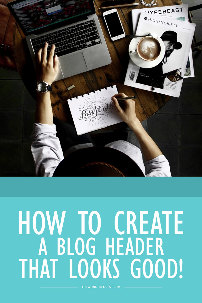
I know that not everybody is born with design skills, so I’m here to give you some hope and tell you that you can still create a nice looking blog header even if you’re not a designer!!
First things first, you’ll need some place to actually create a header. If you have Photoshop, you’re on the right track. If you haven’t yet been using Photoshop, you can use something like Gimp (it’s like a free Photoshop), or Canva.
Step 1: Set your dimensions
Once you’ve chosen your editor weapon of choice, it’s time to set the dimensions of your header. You’ll most likely want your header to stretch the width of your blog. If you don’t know what the entire width of your blog is, you can pop into your Template Editor/Customizer and look for the header area width which should be displayed in pixels.
When you create a New Image or project in any of these programs (File > New), it should ask you for dimensions. Set your custom dimensions to pixels and enter the width of your blog, followed by the height you want your banner to be. There isn’t any rule of thumb for a height, but I would probably keep it under 350px just for aesthetic purposes.
If there is a Resolution or DPI setting, it should be set to 72. Everything for the web should always have a resolution of 72 DPI. Make the background white to make things easier.
Great! Now you have a blank document in the exact size your header will be. Let’s get to the design…
Step 2: Designing your blog header
If you’re one of those people who has no artistic ability, the best advice I can give you is something I learned in 3rd grade… K.I.S.S. — Keep It Simple, Stupid!
A nice looking header does not have to be full of graphics and all of your favourite things. It can be simple and chic without any graphics at all. Fonts are your new best friends.
Some things to remember when keeping it simple:
- Limit your font usage, try a maximum of two fonts.
- Titles should be easy to read. Use a font that is legible.
- If you’re using a fancy font for one element, try a simple font for the other.
- Make sure everything lines up properly
- Try to leave the same amount of padding around all edges
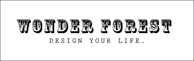
Here are some examples of simple headers:

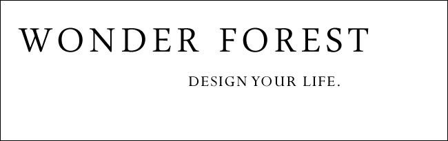
This first header is the simplest of simple. It uses the same font throughout and the tagline is lined up with the end of the “T” in the line above it, making things nice and justified. The padding (white space) on the top and bottom is equal, and the same goes for the left and right sides.

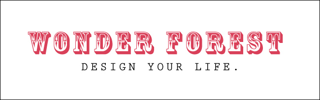
This is an improvement from the first header. See what a difference it makes if you are able to perfectly line up the tagline with the word above it? When things are in line, the design just looks so much more unified. I filled the empty white space beside the tagline with a simple 1px straight line to tie things together a little better.
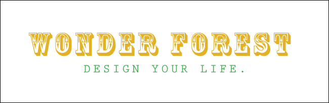
The header above uses different fonts. For the blog title, I used a fancy font, which means that the tagline below it should be something much more simple. I think these two fonts complement each other well because they are both serif fonts and slightly tall. Find fonts that complement each other if you’re going to be using multiple ones. This title font is called Rosewood if you are interested in trying it.
Add a little colour! Once you have your fonts set, you can experiment with a little colour. Again, make sure the colours you choose complement each other and also make sure that the text stands out from the background. So for example, don’t do this:
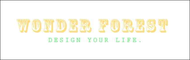
The title is too light and straining on the eyes. It doesn’t stand out like it should against the white background. The tagline is just way too NEON and also strains your eyes when staring at it. Please people, stop using neon green. Instead, if you want to use these colours try toning the hues down a bit like this:
That’s much easier on the eyes, isn’t it? I’m switching back to some more basic fonts because I think the above one is a bit too busy for my liking and doesn’t really give the right vibe of my blog. That is also something you should keep in mind… the overall feel of your blog. Let’s try to knock that one out of the park by adding a little bit of graphic work:

I used the same basic structure as header #2, only I threw in a bit of graphic detail and made sure it didn’t interfere with the text.
You can grab some clipart from sites like Etsy or Creative Market or you can search online for some little graphics. Make sure you have the rights to use the graphics… and by that I mean don’t just go grabbing stuff off of Google Image Search.
The thing to keep in mind with graphics is that you don’t want to overpower the text. The whole point of a header is so people can become familiar with the name of your blog. It is like your own logo.
If you were designing a logo for yourself, you wouldn’t throw in a whole bunch of random photos of yourself and your adventures, would you? So while a header can set the tone for your blog, you don’t need to show everybody all of the highlights from your blog all at once. That is what your posts are for ;).
If you do insist on showcasing a few photos in your header, make sure they don’t distract from the title and are organized in a way that makes the page flow well.
Here are some examples of what not to do:
The justification is all over the place and the padding is off.
No. Just no. Two completely different fancy fonts shoved together looks like this. The tagline is hard to read. This might be cute if the tagline was smaller, not capitalized and in a basic sans serif font.
There are plenty of fonts out there to choose from, and if you grab them from a site like DaFont you can even type your blog name into the “type your text here” textbox on the category pages to see exactly what your title would look like.
Step 3: Saving your header
When you’re set, you’ll need to save that image as a PNG if you decided on a transparent background. Save it as a JPG otherwise. JPG and PNG both work well for web images.
I hope that helped you out a little bit! Just remember to trust your eyes and make sure that everything is properly spaced. You’d be surprised at how simply aligning things and choosing the right fonts can really make or break a header!
Last Updated on
Awesome article
http://www.dubizzle-dubai.blogspot.com/
Thank you so much !This article helps me a lot 🙂
nice one. please how do i make my blogger header float, with the other parts of the blog scroll under the header?
Hey, thanks for the post! Do you know how to check your header dimensions for WordPress?
Designing a banner to maximize practically can be a difficult task and one that can always be done better.The above details are very beneficial for getting some inspiration in banner design.
Thank you for the tips! This has helped me a lot! 🙂
Awesome! Thank you! 🙂
This is very helpfull. I tried doing it like written above.
Do you have any advice for the layout of my blog? lovelysafe.blogspot.de
This was so helpful! Thanks for recommending pixlr, never used it before but your instructions have gifted me with my new header. XOXO Jasmine Monee