
Whenever I need a little colour inspo, I pop on over to Instagram to see what some amazing photographers have captured. This time, I was feeling blank white canvases with pops of colour and neutral tones. These combinations just have such a breezy and clean vibe to them… almost as if you can smell fresh laundry in the dryer and bushes blooming outside.
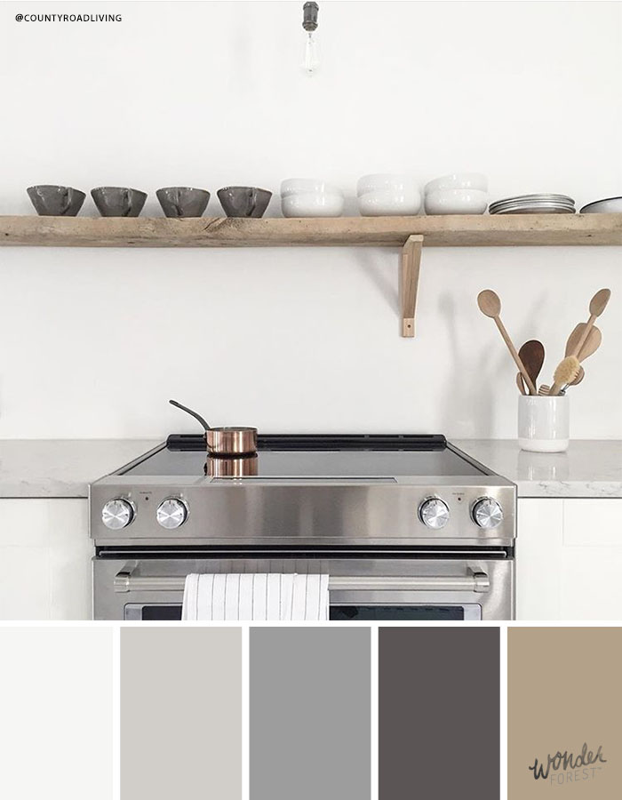
Simple Kitchen Colours // @countyroadliving
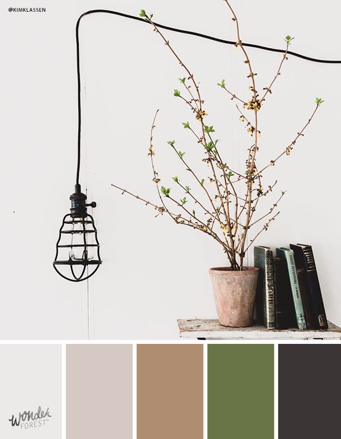
Still and Silent // @kimklassen
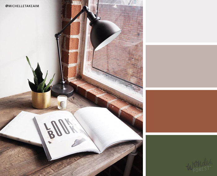
Quiet Nook // @michelletakeaim
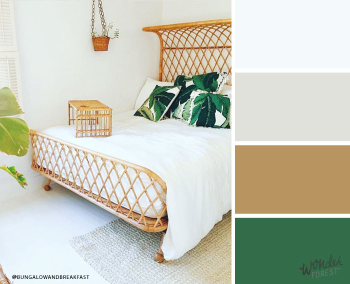
Breakfast in Bed // @bungalowandbreakfast
Check out their accounts for even more great imagery. I hope these palettes inspired your next design!
Last Updated on
Wow I love this! It’s always nice to see different types of palettes coming from different sources!
http://www.rosegoldfox.com/
Nice post 🙂
I have a question. How do you resize images without losing quality? When I try to make my photos smaller (so they fit my blog), they are horrible. Can you help me please? Your photos are stunning 🙂
I love seeing Instagram roundups!
nueyork.blogspot.com
I ADORE these sorts of posts. I’m always looking for new Instagram accounts to follow! These all look fantastic and I love all the different colour palettes 🙂
This is such a good post, I’m loving the proof of more than one colour x
Millie x
queenmillie.blogspot.com